ActiWeight Commercial
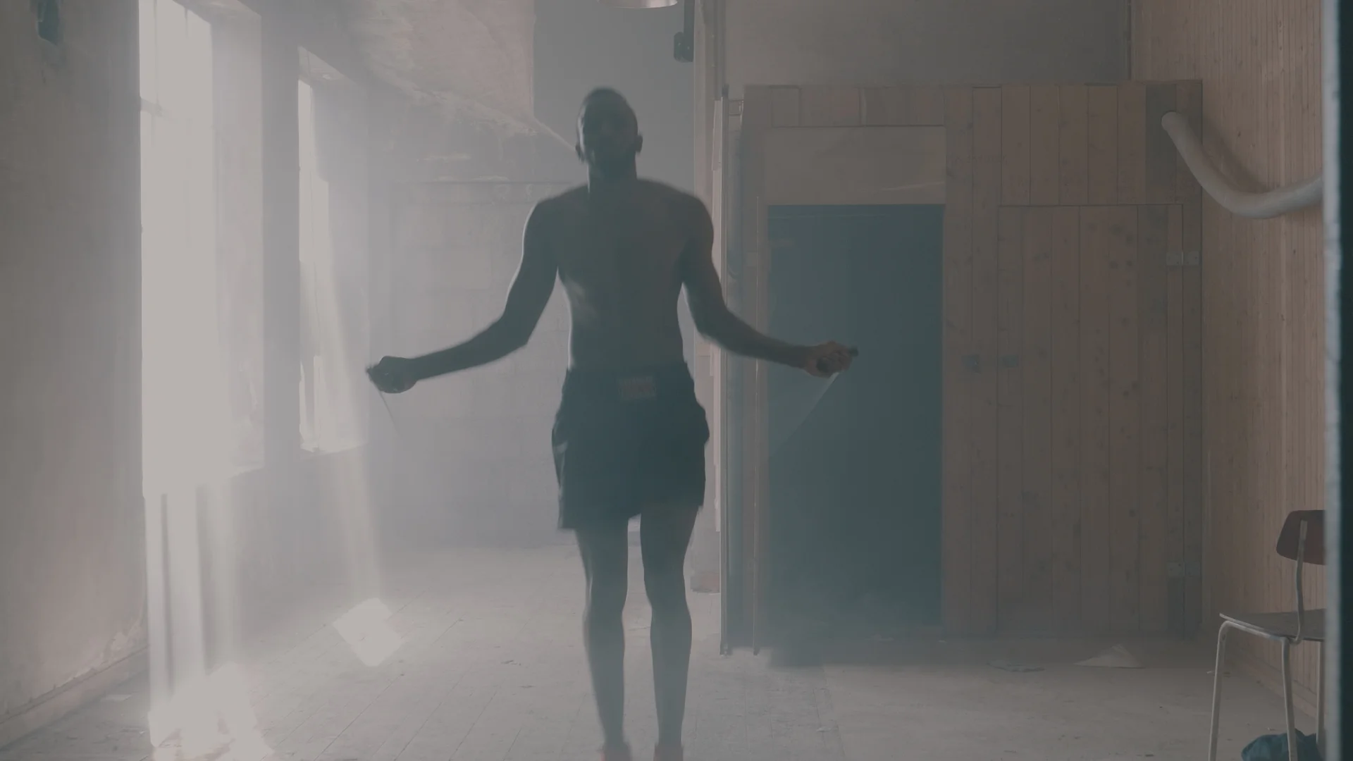
This project was my first international project with overseas clients. We connected through Fiverr (https://www.fiverr.com/nicholsonren) and after watching a sample grade I was immediately on board to be the colourist. The brief was to deliver a look that was "dynamic, delicate and gritty" and as it was also a product commercial - highlight the product. From the sample video, the simplest way to describe the grade they were after would be the highly stylized "superhero" teal and orange look. It was a look that I had not done before but had always wanted to try.
In this breakdown I will compare the original raw file to the final grade to show the differences. Then I will go through step by step of a couple of my favourite shots to show you how I came to the final image.
Raw comparison
The raw footage was shot in V-log 4K on the Panasonic GH-5. I received a final cut in 4K DNxHR HQX codec through dropbox and proceeded to make the cuts myself in Da Vinci Resolve. To deliver back to the client the same resolution and codec was used.
The teal colour comes out really well in the shadows and really sells the stylized look. I had to be careful not to push the skin tones too far orange but keep it as natural as possible. The gritty feel comes from pulling down the gamma to introduce more contrast in the faces and hide some detail in the shadows.
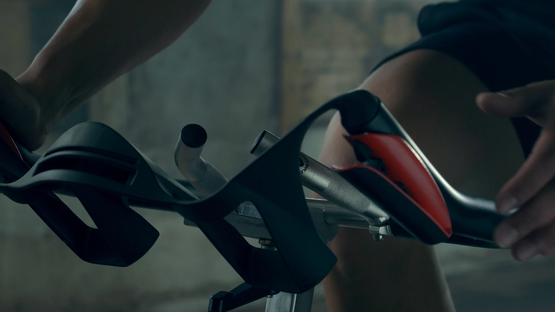
Highlighting the product was an important detail which I achieved by placing a power window over the product and slightly increasing the contrast and brightness to bring it above the green/teal hues. It isn't overly highlighted in order to keep the look and feel within the gritty texture of the world but by boosting the colour slightly your attention is drawn to it first.
Step by Step Breakdown 1
This was one of the first and favourite shots to colour as the tone and look embodied the feel I was trying to get. It was one of my hero shots which I referred back to in order to get a consistent look throughout. From the raw file you can just about see the separation of colours from the background and the subject's skin. I knew that if I needed to I could refine each layer individually by isolating them in their own node.
The first step was to expose the image to a level which I thought would look gritty and strong. Straight up you can already see the colours are vivid and complementary, there wouldn't be much colour stretching to get the image to look good. To get a nice contrast I had to push up the highlights and lower the shadows until the details in the woodwork are lost but that is fine because it suits the tone which I was going for. The skin tone at this stage could pass for something more bold but it could also be considered too orange.
To affect just the skin tones I drop picked the skin in the Hue vs Sat curve and brought down the oranges/reds. This made the image more gritty and cinematic.
Using the same technique for the background shadows I introduced a bit of green to the blues to make the final look. Finding the technique to affect just the oranges and blues took slightly longer than anticipated. I was qualifying and creating additional nodes for just the skin tone and background which complicated things for awhile because I couldn't get a clean separation. The kicker light from the right introduced some blue into parts of the skin and I couldn't get a gradual separation. The drop pick Hue/Sat curves solution let Resolve select the colours to affect more finely than I could have done through qualifying.
Step by Step Breakdown 2
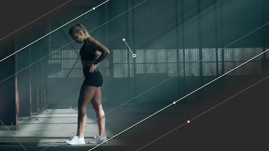
This second breakdown is also the second shot of the commercial and one of the more interesting set ups I did. From the raw file the colour separation isn't as clearly visible as in the shot above. But based off the luminance in the scene, you can sort of see the difference between the light and dark areas that could be coloured differently and separated. Another thing that I noticed is the leading lines from the ray of light pointing towards the subject. I knew that I would have to enhance this shape to direct the viewers eyes.
Setting the exposure to a level which I thought was appropriate. I pushed the highlights to a point where the detail in the shoes are still visible and the shadows aren't crushed.
Introduced a blue hue to the shadows and kept the skin tones as neutral as possible. The process at this point is very similar to the shot above. Once the tone is set it is just about refining the hues to get the look you want. As the athlete and background are now clearly separated it was simply using the drop pick technique to get the colours to where I wanted them.
I added a rectangular power window in the same direction and shape of the ray of light to focus the viewers eyes onto the leading lines and subject. Within the power window I increase the brightness and contrast slightly to make just this portion of the image stand out. The ray of lines becomes more defined and clearer while the athlete pops out of the background even more than she already does.
The final grade had a little more green added to shadows to get more of a teal look and the ray of light is slighty more defined and noticeable.


